


Looking at major equity indices only over the past month, you could be forgiven for thinking little has changed. Underneath the surface though, capital continues to rotate between sectors, industries, regions and business models. Some sectors continue to be the early recipients of newly created money, while others are beginning to lose momentum despite seemingly healthy economic data.
For investors, the question is no longer simply whether equities rise or fall, but which sectors continue attracting new capital as monetary conditions evolve.

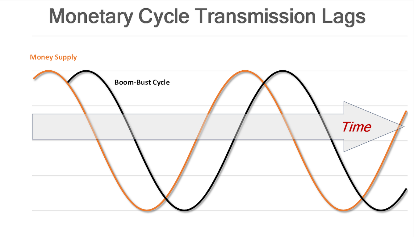
Volatility remains in equities with June performance ending in the red in the US, following two solid months of positive returns. The fluctuations are why we view money supply as of vital importance. This allows us to determine where we are in the central bank/commercial bank driven boom-bust cycle and how to allocate accordingly. It is more of a medium to long term approach as we focus on the preferred sectors over the course of the cycle.
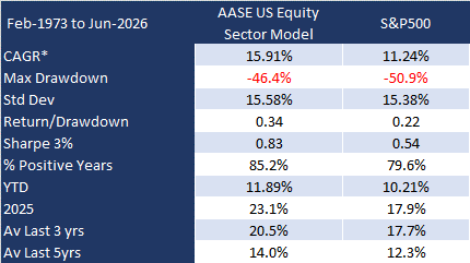
We’ve also shown that using this approach it appears possible to generate superior notional performance.
Below are the notional results of the US approach:
Why We Focus on Money Supply
Most investors begin with company earnings. Others begin with valuations. Our starting point is different. We view changes in money supply as the primary force driving the boom-bust cycle. Newly created money does not affect every part of the economy simultaneously. Instead, it spreads gradually, benefiting some recipients long before others.
This process creates identifiable patterns of sector leadership that have repeated across multiple economic cycles.
Understanding where an economy sits within that cycle provides a forward-looking framework for sector allocation rather than simply reacting to backward-looking economic statistics.
A more detailed discussion of our process and the logic surrounding it can be found in our previous post here.
This report reflects the application of our approach to the allocation of capital across different stock market sectors.
Here are the two key framework charts:
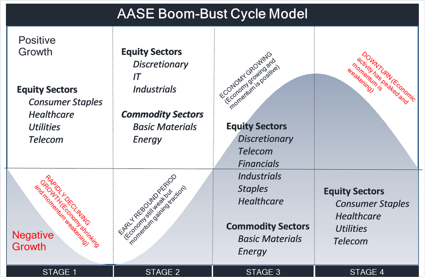
This template is varied slightly according to the industrial structure of each particular economy.
In this month’s edition of our sector allocation modelling we update readers on our latest portfolio changes.
Contents
US Sector Allocations
European Sector Allocations
Japanese Sector Allocations
Australian Sector Allocations
UK Sector Allocations
Canadian Sector Allocations
Summary Matrix
We begin with the US.
